← Dror Poleg's Data Dashboard

Chart collection

The Economics Canon

Living versions of classic economic charts, paired with their original claims and the limits of their modern measurements.

8 charts · every one live and refreshed with the rest of the dashboard

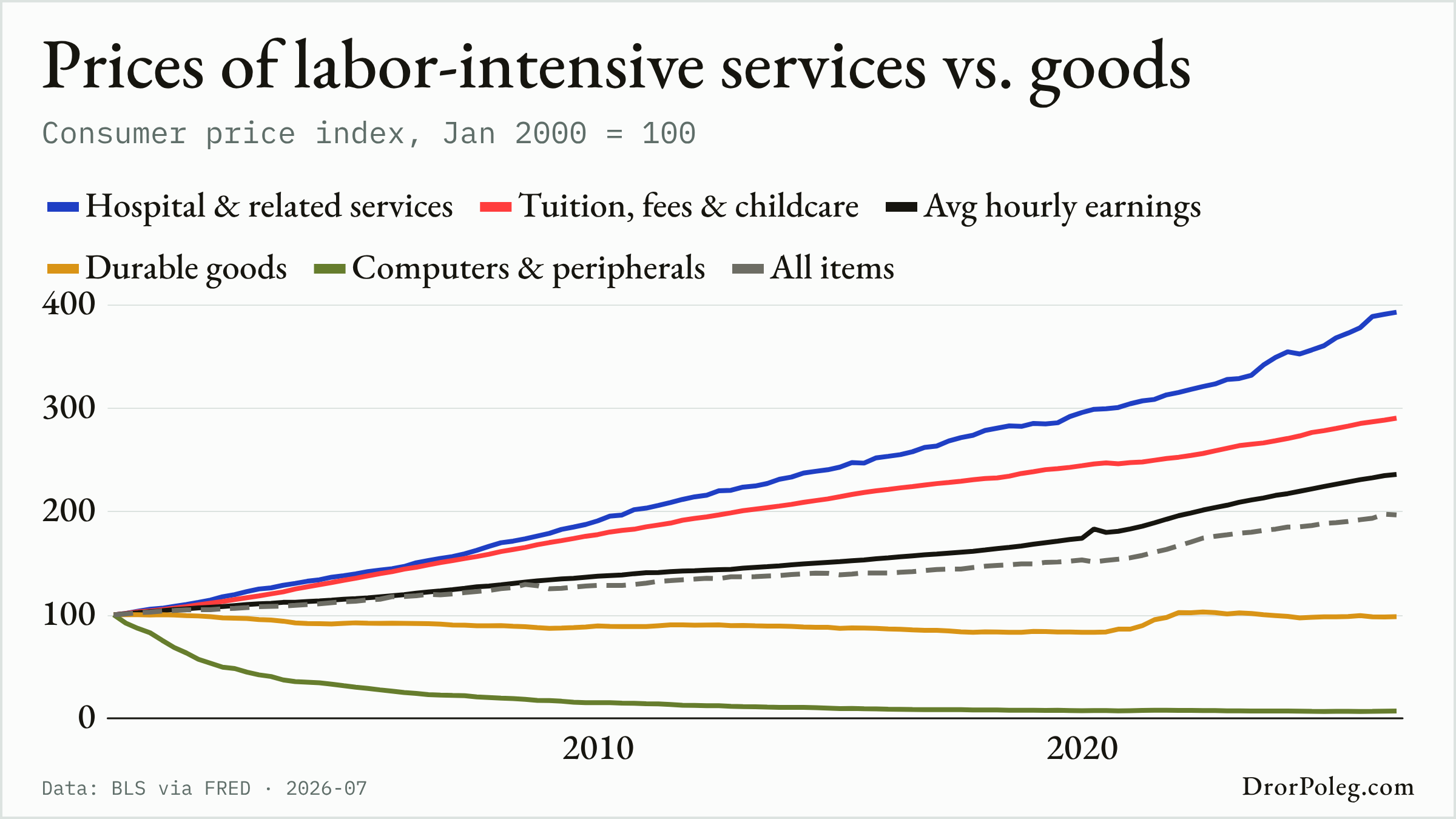
Prices of labor-intensive services vs. goods
01 / 08

The Chart of the Century

Prices of labor-intensive services vs. goods · updated 2026-07

The original claim
Productivity differences can make labor-intensive services grow more expensive relative to manufactured goods.
What this chart measures
BLS CPI-U component indices and average hourly earnings, rebased to January 2000.
Where it departs
This is a modern U.S. price comparison in Baumol's tradition, not a replication of the 1966 analysis; quality adjustment and changing consumption categories matter.
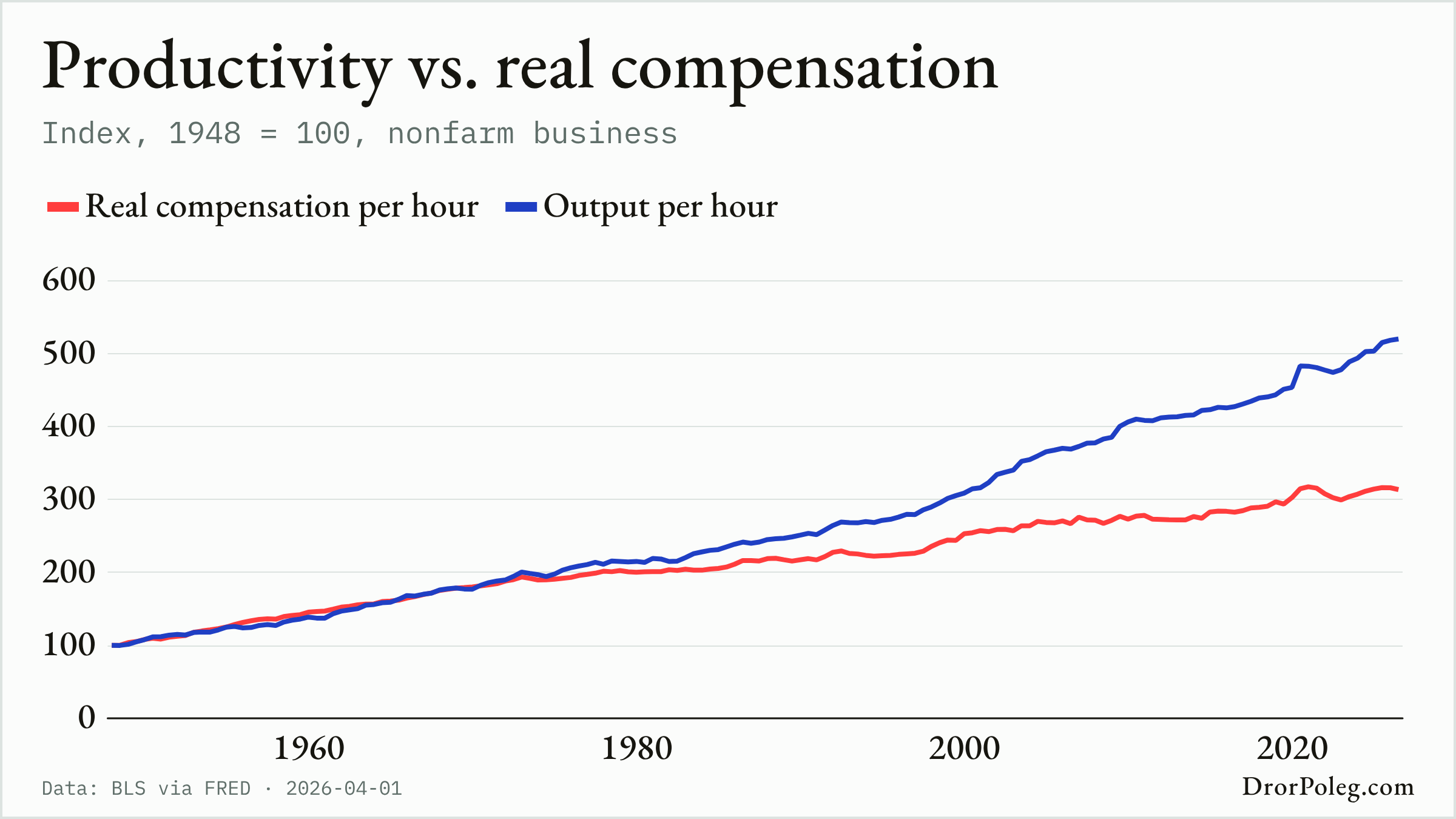
Productivity vs. real compensation
02 / 08

The Great Decoupling

Productivity vs. real compensation · updated 2026-04-01

The original claim
Typical worker compensation stopped rising in step with economy-wide productivity.
What this chart measures
BLS nonfarm-business output per hour and real compensation per hour, each indexed from 1948.
Where it departs
Real compensation per hour is a broad average and differs from EPI's typical-worker compensation construction, so this chart is related to the canonical exhibit rather than an exact reproduction.
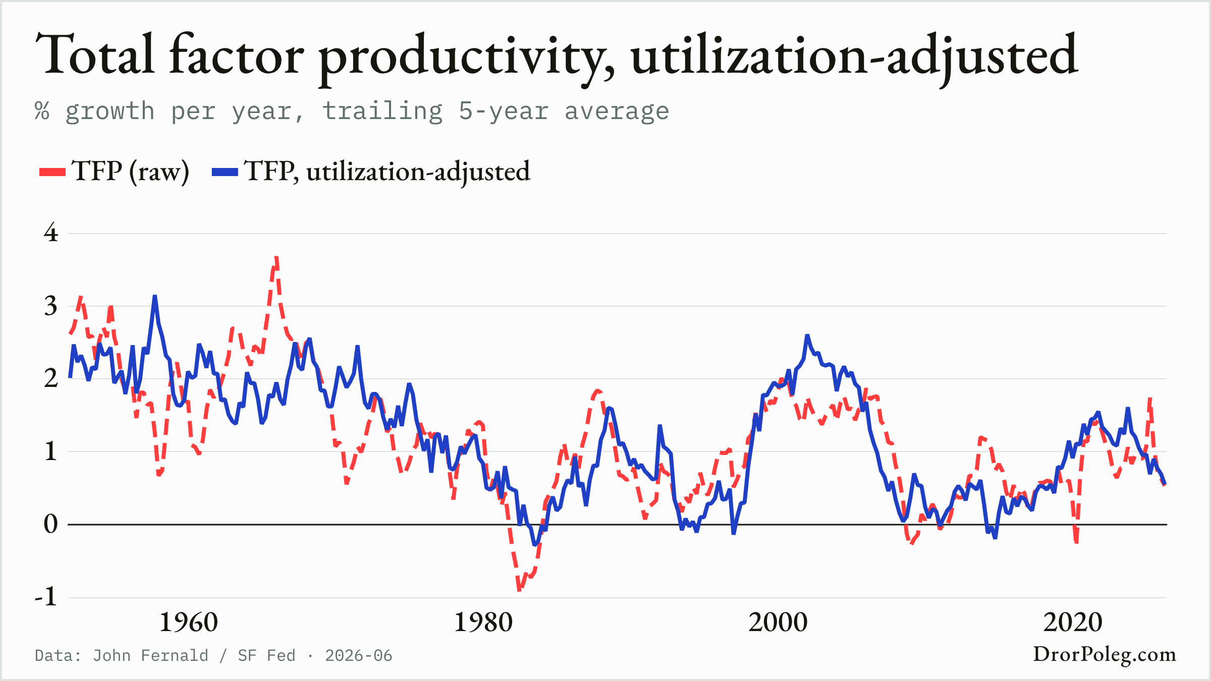
Total factor productivity, utilization-adjusted
03 / 08

The Solow Residual

Total factor productivity, utilization-adjusted · updated 2026-06

The original claim
A large part of measured output growth remains after accounting for growth in labor and capital inputs.
What this chart measures
John Fernald's utilization-adjusted total factor productivity growth series for the U.S. business sector.
Where it departs
TFP is a residual shaped by measurement, model assumptions, utilization adjustment, and revisions; it is not a direct observation of technology.
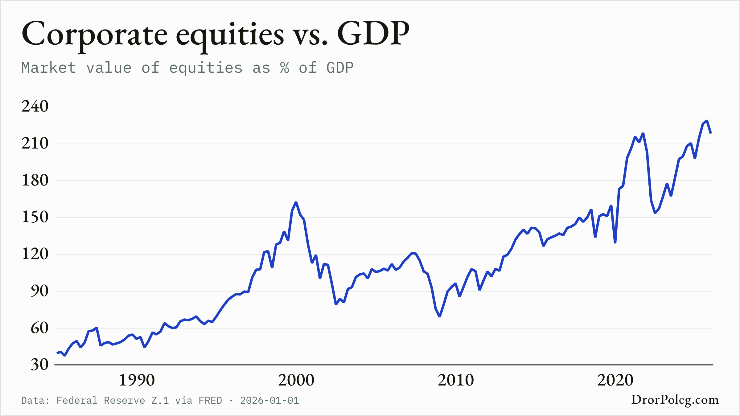
Corporate equities vs. GDP
04 / 08

The Buffett Indicator

Corporate equities vs. GDP · updated 2026-01-01

The original claim
The value of the stock market relative to national output is a broad gauge of aggregate valuation.
What this chart measures
Federal Reserve corporate-equity market value divided by nominal U.S. GDP.
Where it departs
The numerator and denominator cover different economic universes, and globalization, sector composition, interest rates, and intangible assets can change the ratio over time.
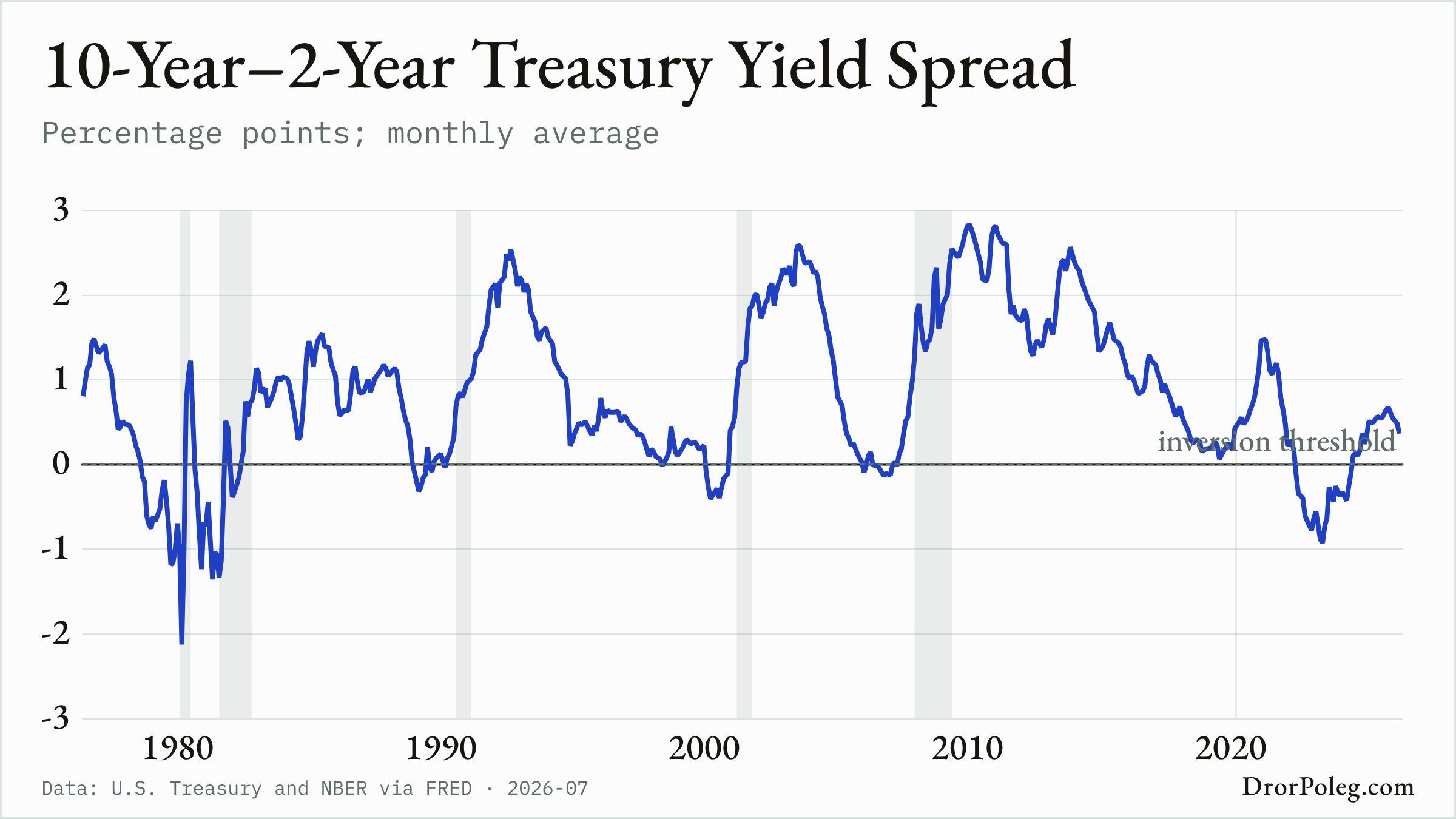
10-Year–2-Year Treasury Yield Spread
05 / 08

The Inverted Yield Curve

10-Year–2-Year Treasury Yield Spread · updated 2026-07

The original claim
The term structure of interest rates contains information about subsequent economic growth.
What this chart measures
The monthly 10-year minus 2-year U.S. Treasury yield spread, with NBER recessions shaded.
Where it departs
An inversion is an empirical signal rather than a deterministic forecast; monetary policy, term premia, and the chosen maturities affect the reading.
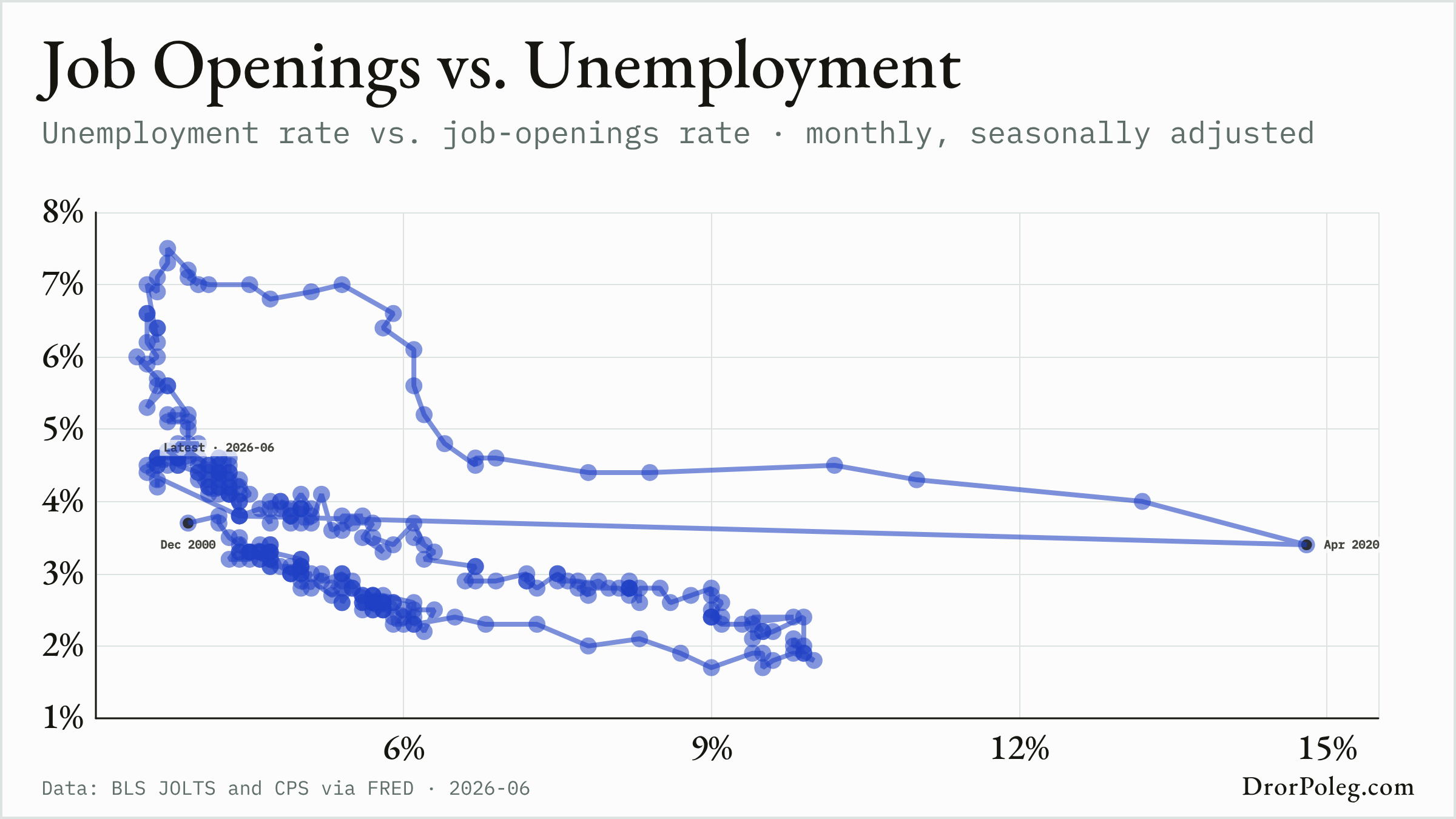
Job Openings vs. Unemployment
06 / 08

The Beveridge Curve

Job Openings vs. Unemployment · updated 2026-06

The original claim
Job vacancies and unemployment usually move in opposite directions over the business cycle, while shifts in their relationship can reflect changes in labor-market matching.
What this chart measures
Monthly U.S. total-nonfarm job openings and U-3 unemployment rates from December 2000 onward.
Where it departs
The modern JOLTS/CPS pairing uses different surveys and denominators, covers only the JOLTS era, and does not identify why the curve moves or shifts.
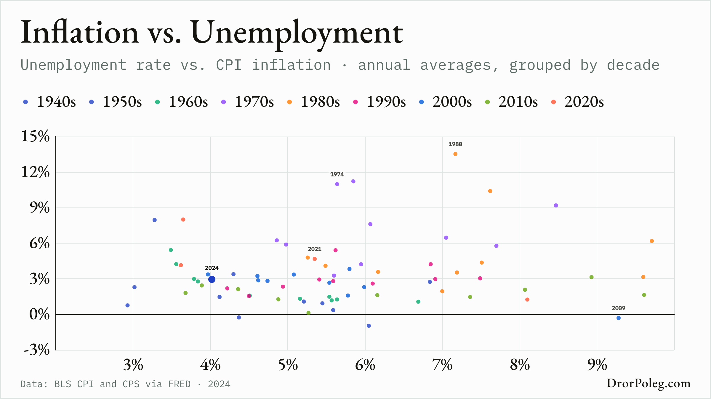
Inflation vs. Unemployment
07 / 08

The Phillips Curve

Inflation vs. Unemployment · updated 2024

The original claim
Lower unemployment was associated with faster money-wage growth in Phillips's historical British data.
What this chart measures
Annual-average U.S. U-3 unemployment and year-over-year CPI-U inflation, shown as yearly observations grouped by decade from 1949.
Where it departs
This uses U.S. price inflation rather than Phillips's British wage-inflation measure and does not control for expectations, supply shocks, productivity, policy, or changes in labor-market composition.
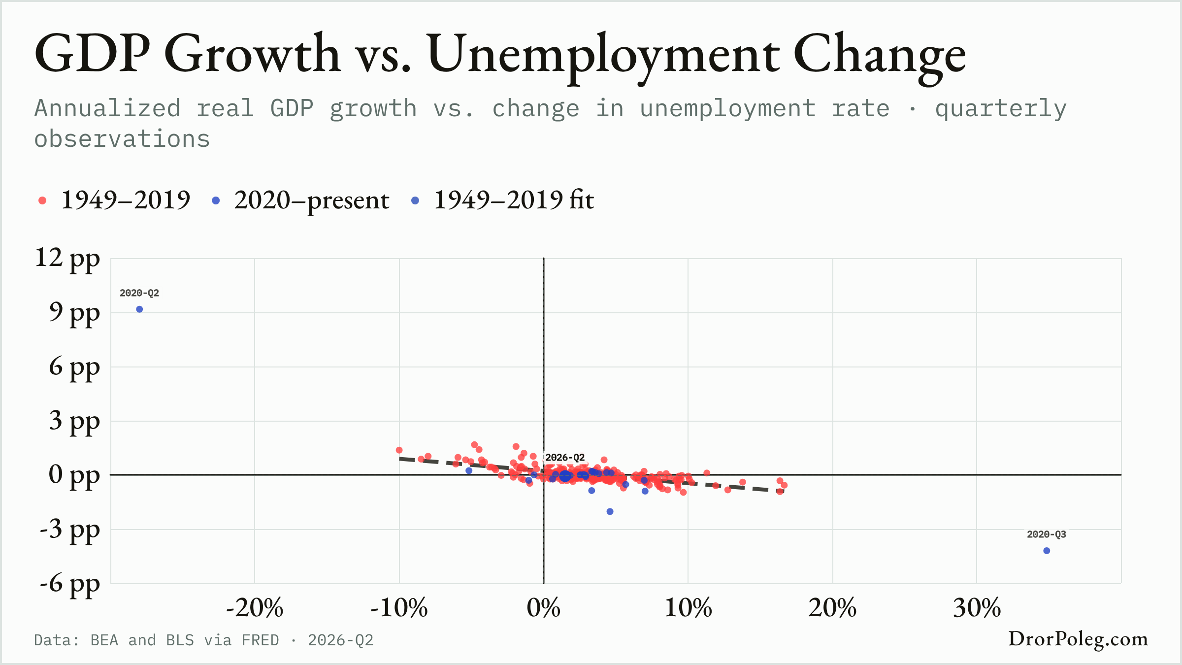
GDP Growth vs. Unemployment Change
08 / 08

Okun's Law

GDP Growth vs. Unemployment Change · updated 2026-Q2

The original claim
Changes in unemployment are systematically related to departures of output growth from its normal pace.
What this chart measures
Annualized quarter-over-quarter U.S. real-GDP growth against the quarterly change in average U-3 unemployment, with a fixed 1949–2019 fit.
Where it departs
The coefficient depends on sample, specification, revisions, productivity, labor-force participation, and hours; this difference version is not Okun's original output-gap calculation and is not causal.

Why these are rebuilt, not reprinted

Each entry pairs a famous claim with a live measurement made from public data available today. The modern series is rarely the original author's series: definitions move, agencies revise, and some of the original data was never published in a form anyone can refresh. Every entry says what it measures and where it departs from the exhibit it descends from, so the chart can be read as evidence rather than as a reproduction.